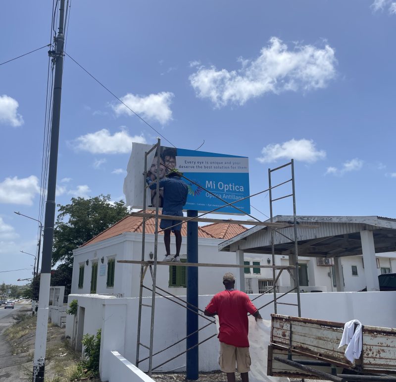
Rebranding of Optica Antilliana
Brand strategy
Following the strategic split from Optica Antillana, the Curaçao-based company entered a new chapter under a new name:
Mi Optica. The ambition was clear — to reposition the business from a trusted local optician to a premium brand focused on specialist eye care and a higher-end clientele.
The Assignment
– Define a clear premium brand positioning
– Develop a distinctive and future-proof visual identity
– Elevate brand perception to match the level of expertise
– Preserve the company’s heritage within the new brand
The Challenge
While the name changed, the legacy remained important. At the owner’s request, Optica Antillana was intentionally integrated into the new logo — honouring the company’s heritage while signalling its evolution. The real challenge was perception: the quality of care, technology, and service were already premium. The brand now needed to express that same level of authority and sophistication.
What we delivered
- Strategic positioning session
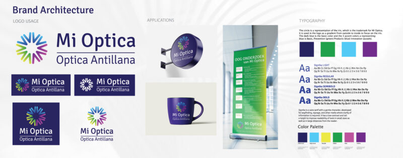
- Brand architecture and identity development
- Logo design merging heritage and modernity
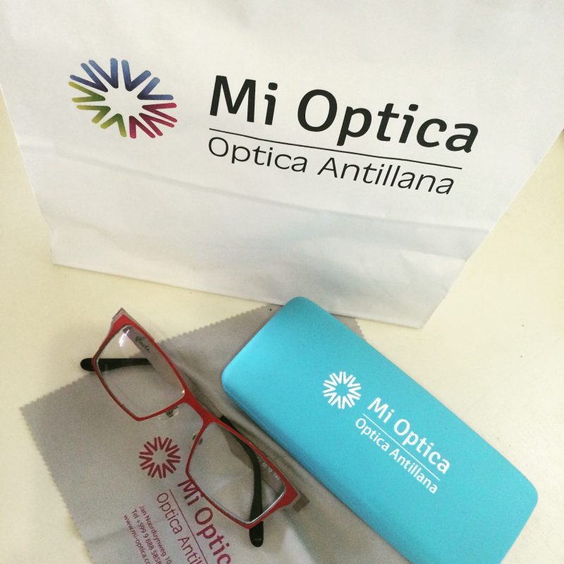
- Comprehensive visual identity system
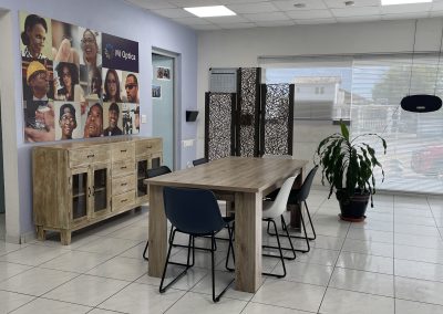
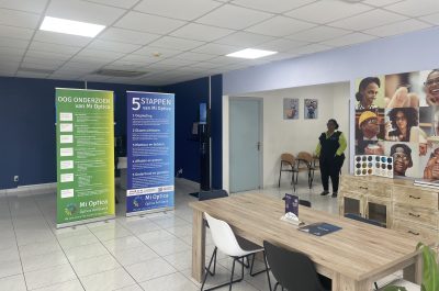
- In-store recommendations to reinforce the premium positioning
Result:
A refined, contemporary brand identity that positions Mi Optica as a leading premium eye care specialist in Curaçao — rooted in heritage, designed for the future.